Sunday, March 30, 2014

Lab 7 UAV Platforms

The purpose of this exercise was to observe different aerial platforms that could be used to obtain imagery. Four different platforms were deployed in a park in the city of Eau Claire, Wisconsin, and included two rotary-wing UAV, a kite, and an experimental run of a model rocket with a small video camera attached to it.

Rotary-Wing:

The first platforms to be deployed was rotary-wing UAV (copter 1) that was owned by the professor (fig. 1). The UAV, which had the capability to be flown manually via remote control or via an autopilot mode using preprogramed GPS-based waypoints, was operated by a UWEC student, Max. Copter 1 was fitted with 6 propellers, with 3 on top and 3 complimentary propellers beneath each of them (fig. 1).

The purpose of the 6 propeller arrangement on copter 1 likely served two purposes: 1) to increase the UAV's payload capacity by providing more lift and 2) to help to compensate for engine loss and bring the copter back should engine failure occur, as per Max.

The first copter was also fitted with a camera that could provide real-time imagery to the operator (fig.2a). Figure 2b shows the remote control for copter 1.

Flight of copter 1 appeared to go smoothly and lasted about 10 minutes or so. Figure 3 shows copter 1 just prior to take off (3a), and maneuvering in the air over the soccer park. The UAV was relatively quiet and agile while in flight.

Figure 1


Figure 1 shows two photos of copter 1 on the ground, the lower one for scale. Note that copter 1 has a total of six propellers which allow it to lift a heavier payload or to increase flight-time.

Figure 2

a)
 b)
Respectively, figures 2a and2b show the goggles used to provide the operator with real-time imagery as they operate the copter and the remote control used to manually control the UAV.

Figure 3
a)
 b)
 c)
Figure 3a shows copter 1 just before it was launched, while figures 3b and c show the UAV maneuvering over the Eau Claire soccer park.

The second rotary-wing UAV (copter 2; fig.4a) was flown for the class as well. It was unclear whether or not copter 2 was fitted with the goggles like copter 1. However, it still had a digital camera (fig.4b) attached to it in order to obtain aerial imagery. This camera could be programed to take photographs at a pre-programmed time interval while in flight. Also, the camera in figure 4b can be maneuvered via the operator from the remote control in order to control the angle of the photograph taken. Unfortunately no imagery from its flight was available. Figure 4c shows a close up of copter 2 and the GPS chip that it uses when in auto-mode (under the plastic dome).

Figure 4
a)
b)


 c)
Figure 4a shows copter 2 in the car. Figure 4b shows copter 2's camera and camera-rig, which can be maneuvered via remote control by the operator. Figure 4c shows the GPS chip that allows the UAV to be flow in "autopilot" mode to predetermined waypoints.


Sunday, March 9, 2014

Lab 6: Microclimate Geodatabase Construction for Deployment to ArcPad

Geodatabases (GDB), such as those utilized by ArcMap and ArcPad, are important because they store geospatial data. However, more than simply a storage unit for data, an effectively managed and neatly organized geodatabase can alleviate some of the stress associated with data collection in the field, since many of the device that are compatible with ArcPad are small and slow with regards to their random access memory, or RAM.

One such device is the $2400 Trimble Juno 3 handheld computer. While the Juno has an excellent storage capacity with regards to memory, about 2 GB of flash memory, the RAM for this device tops out at 256 MB (http://farmworks.com/products/trimblejuno3); comparatively, a  $350 Dell lap-top sold on Amazon.com has nearly 16 times more RAM as the Juno. While the flash memory indicates how much data can be stored on a digital device, such as the Juno, the amount of RAM that a device has determines how quickly that data can be retrieved and used: the more RAM, the faster the computer.

Since rugged, portable, top of the line computers, such as the Juno, have comparatively less RAM than a run-of-the-mill laptop, the need for a well organized, efficient GDB become quite apparent. This is because while out in the field a portable computer like the Juno will store data much more easily than it will create new feature classes, for instance. Software programs such as ArcPad can then be used to link the portable device to faster computers in the lab in order to feature classes much more efficiently.

In this lab a GDB will be created and set up for future use in the field when the geospatial field methods class will conduct a microclimate survey of the UWEC campus. Below are step-by-step procedures that were used to create  the new GDB, establish domains within that database, create a new feature class (FC) with connections between its fields and the domains created prior, as well as where to store such information in the appropriate format.

Creating a Geodatabase and Establishing Domains:

  • In ArcCatalog, establish a folder connection. This is the location where the geodatabase will be stored.
  • With the appropriate folder open, right click on the large contents screen in the ArcCatalog interface and select new, and then file geodatabase from the resulting drop tabs. Name the new GDB appropriately.
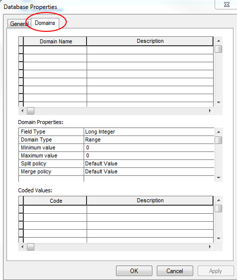
  • Next, right click on the new geodatabase that was created above and select properties from the resulting drop tab. This will open a database properties (DBP) interface; click on domains tab:                            
 
 
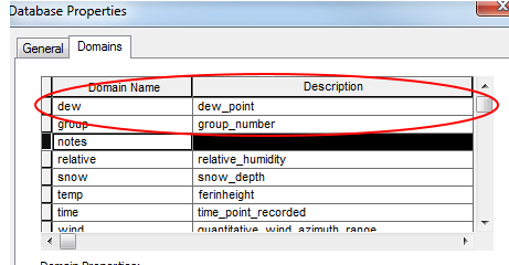
  •  In the DBP interface click on domain name and enter the appropriate data. For instance dew, group, notes, relative humidity, snow depth, temperature, etc. Domain names should be short and absent of capital letters as this can cause issues in the program More descriptive information can be placed in the description field next to the domain name, for instance, indicating what system was used to measure the temperature:


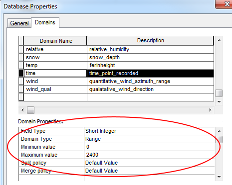
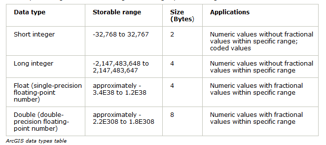
  • Next, while the domain name is highlighted in the DBP interface one can edit the domain properties. This step is necessary because it will allow one to select the field the field type (e.g. float, short-/long-integer, text, etc.). For instance, a float would be used to enter a numerical value that has decimal values associated with it, as represented by domains such as temperature, dew point, and snow depth. In contrast, short integer would be used for an established range, up to 32,767, which is fine for domains with low integer values such as time of data collection. A table of these types of data from ArcGIS help is found in figure 1.
         By establishing a numerical range in the GDB, one can limit the numerical values that are
         entered into each domain in the field. this is a useful measure to prevent erroneous data entry.
         For example, in a domain created to record data for air outside air temperature one might set
         establish a maximum range value of 140 and a minimum value of -50, as anything more or less
         would be unlikely:


  • Once all the appropriate domains are created and their respective properties established, click on OK in the DBP interface.
Figure 1
 Figure 1 displays a table created by ArcGIS and shows different domain field types that can be used when creating a domain for a Geodatabase: short-/long-integer, float, and double. Also, the table shows the respective storable ranges, size, and some generic applications of each data type.

Creating a Feature Class with Fields From the Domains Created Above:

The next part of this lab will explain how to create a point-feature class with fields that correspond to the domains created above. Creating a single feature class, as opposed to creating one representative of each domain, will allow portable computers deployed in the field to operate quicker. This is because only saving temperature as data is much less computationally costly than if a feature class were created solely for it.

 
  • Right click on the GDB that was created above and select new and feature class from the resulting drop tabs. This will open the new feature class (FC) interface.
  • In the FC interface, choose an appropriate name for the FC that is about to be created.
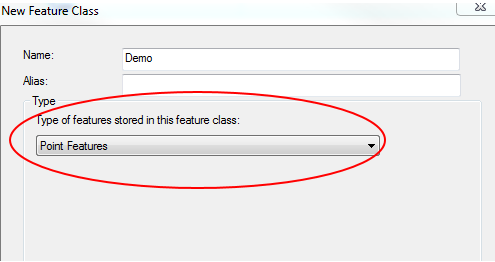
  • Next, change the FC type from the default parameter of polygon features to point features and click next:


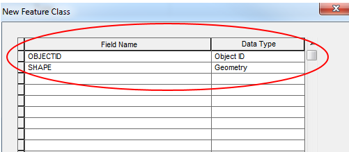
  • Next, in the FC interface, set the projected coordinate system. In this case the UTM NAD 1983 system will be used, as this corresponds to the imagery that will be used to plot the FCs in the field later on. Click next until the FC interface displays the field name and data type tables:

 
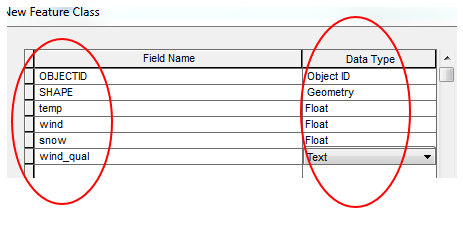
  • Type in the field names as was done previously (e.g. wind, wind_qual, temp, etc.) for the domains and their respective data type (e.g. float, short-/long-integer, text, etc.):

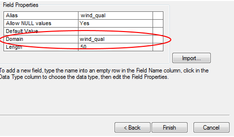
  • Next, click the domain section of the field properties section of the FC interface (below the field name section). Doing this should result in a drop down with the domain names in it. Select the domain name that corresponds to the fields created above (e.g. temp and temp, wind_qual and wind_qual, etc.). This will tie each new field to the domain created earlier in this lab:


  • Click finish to create the new feature class.

The FC that was created using the steps above now needs to saved along with the appropriate raster imagery as an .mxd file in ArcMap and stored in the newly created geodatabase; doing this will ensure that the new feature class created above can be used to collect the desired data in the field.


Saturday, March 1, 2014

Lab 5: Creating a Topographic Map For Land Navigaton

Introduction


   The objective of this lab is to create two topographic maps for purpose of land navigation; with one map using the universal transverse Mercator (UTM; in meters) projection and the other using the geographic coordinate system (GCS; in degrees). The topographic maps will be created using ArcMap 10.2 with map data provided by the instructor of the course.

   The topographic maps will represent a location in Eau Claire, Wisconsin known as the Priory. The Priory serves UWEC by providing residential quarters to students and by providing an outdoor learning environment, which includes a navigation course. It is on this navigation course that the maps produced in lab 5 will be put to the test in terms of accuracy later in the semester.

Methods

Selecting Data

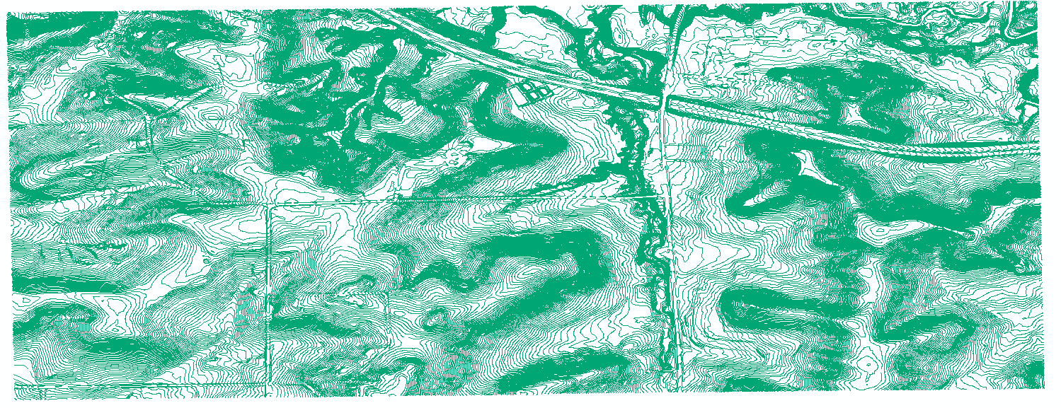
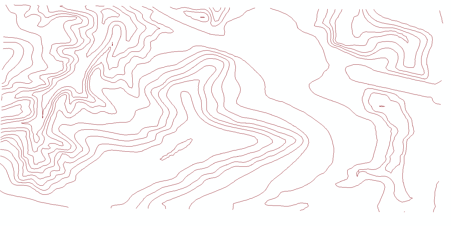
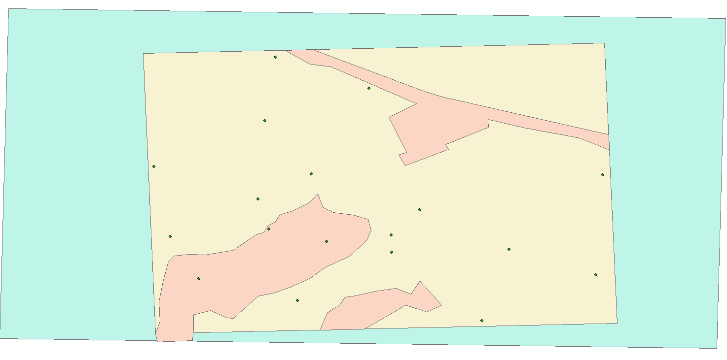
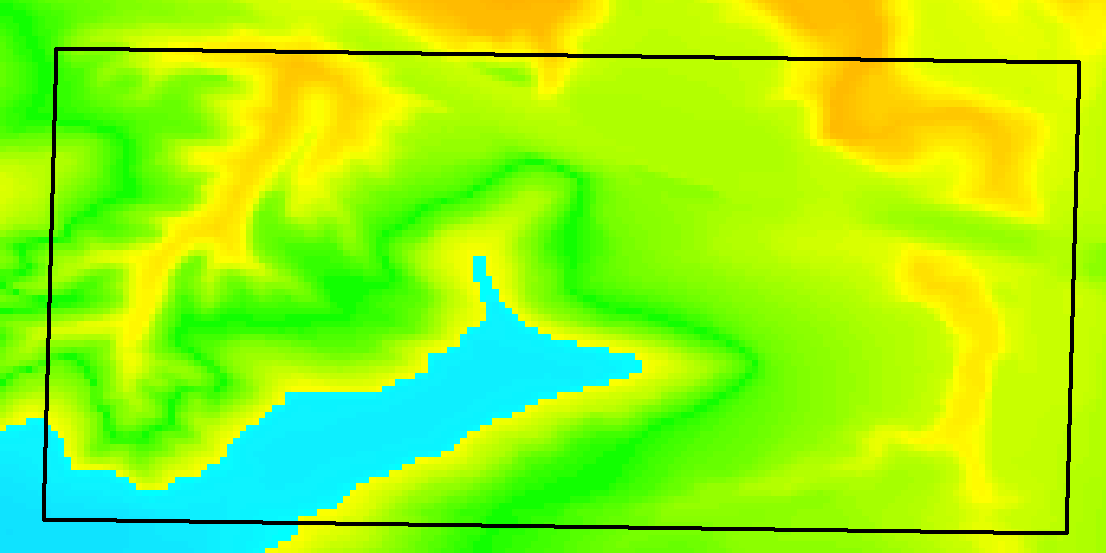
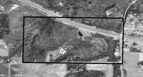
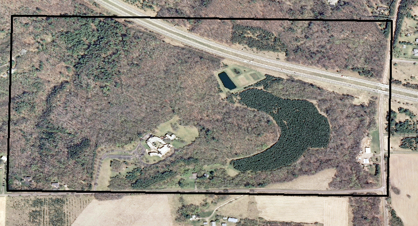
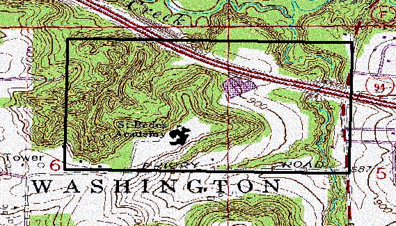
   As previously mentioned,  geospatial data were provided for the class to aid in the creation of the two topographic maps for this assignment. Shown in figure 1 are some of the feature classes and aerial photos that were available to construct the maps. Figure 1a shows the 5-meter contour lines, from a USGS DEM, while 1b shows the more detailed 2-foot contour intervals that were created from a UWEC survey of the Priory shortly after it was purchased by Blugold Real Estate, LLC (Bristol, 2013). Figure 1c shows three feature classes that were provided of the priory and include a navigation boundary (green polygon), navigation-course points (green points), navigation-course boundary (beige polygon), and "no shooting zone" (red polygon). The next set of data provided to the class were from USGS and include a DEM (fig. 1d), a black and white (B/W) aerial image (fig. 1e), a true color aerial image (fig.1f), and a topographic map (fig. 1g). The images in figures 1d-g also have the outline of the hollow navigation boundary to illustrate the Priory's location in each image.

Figure 1
a     b
c d
 e f                                
                                        g
Figure 1 displays the various feature classes, DEMs, and aerial images that were provided for the creation of navigation maps for lab 5. Respectively, figures 1a and b show the 2-foot and 5-meter contour line feature classes. Figure 1c shows the following polygons: navigation-course boundary (green/blue), navigation-course point boundary (beige), and the "no shooting zone" boundaries (red); 1c also shows the course points (green).  Figures 1d-g, all from the USGS, show a DEM of the priory (d) black/white and color aerial imagery (e and f, respectively), and a digitized topographic map. 

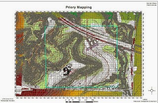
    When creating a map for the purpose of land navigation, it is important to limit the amount of clutter; failure to do so could result in a map that is too confusing. For instance, the instructor provided the class with two different feature classes for the topographic lines in the map, with one of them representing 2-foot intervals and the other 5-meter intervals. Figure 2 shows an image produced by one of the previous year's geospatial field methods students, Hannah Bristol (2013). In the image, Bristol displayed all the feature classes, aerial photos, digital elevation models (DEMs) provided for this assignment. Bristol did a good job at conveying the clutter that would be associated with a map using all the data that were provided.

Figure 2

Figure 2 shows a map created by Hannah Bristol to illustrate how a map that uses too much information can be confusing to the point of impeding land navigation.

  The following data from above were incorporated into the land navigation maps for this assignment: the 5-meter contours, the navigation- and point-boundaries, and the B/W aerial imagery.

    While the 2 foot intervals displayed the Priory's topography most precisely, the 5-meter contours were chosen to be consistent with the UTM projection, which uses meters as well. Furthermore, pace counts were taken in class; these were based on 100-meter intervals as well.

   Navigation- and point-boundaries were used to create the land navigation maps as well. These two feature classes were useful because they pinpoint the area of interest (AOI). This will aid in navigation because one will be more likely to determine where they are in the course if they can visualize and pin-point these boundaries.

   Finally, the B/W aerial USGS images were used in order to more accurately portray the AOI. For example, using the aerial data could aid in the identification of nearby ground features such as roads, ponds, and forested vs. open areas.

Creating the Maps

   In order to create the maps, the data discussed above, 5-meter contours, boundary shapefiles, and aerial images of the priory were loaded into ArcMap 10.2. The first map that was created used the UTM projection. According to a USGS publication on UTM projections, UTM is the preferred projection for smaller AOIs, e.g. county or municipal AOIs as well as those in the typical USGS quadrangles USGS (USGS, 2001). Projections such as the UTM system are used to convey the elliptical surface of the earth on a flat medium, such as a map. In order to portray the curved surface of the earth on flat media, mathematical calculations, which are beyond the scope of this report, are performed in order to ensure minimal distortion and thus preserve the accuracy of points on a map.

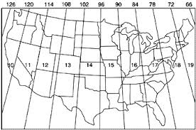
   Shown in figure 3, the UTM projection system partitions the globe into 60 north and south zones with 6o  between each zone; the data for the map in this project uses UTM zone 15N. As mentioned above, the UTM system uses a Cartesian coordinate system based on meters, which allowed for more convenient distance calculations in the battlefield, where the UTM system originated (USGS, 2001).

Figure 3


Figure 3 shows the 10 northern UTM zones as they span the conterminous United States. Each zone is a projection of a 6o swath of a global coordinate system (https://www.e-education.psu.edu/natureofgeoinfo/c2_p22.html).


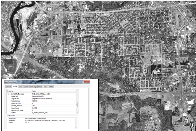
    The first map layers that were loaded were the two B/W aerial images; both images were needed in order to accurately show the AOI and both used the North American Datum 1983 coordinate system and were projected using UTM zone 15N (fig. 4).

Figure 4

Figure 4 shows the B/W aerial images as they appeared in ArcMap. The photo in the lower-left hand corner indicates that the coordinate system of for these images is NAD 1983 with a projection in UTM zone 15N.

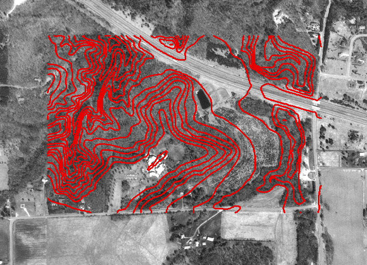
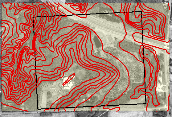
   The next set of data to be used for this map were those showed the 5-meter contours (fig. 5). This data set was placed on top of the B/W aerial images and used the NAD 1983 coordinate system in addition to being projected in UTM zone 15N as well. The contour lines were colored red and increased in weight from 1 to 2 so that they would be more distinguishable against the B/W aerial images.

Figure 5

Figure 5 shows the 5-meter contour lines that were placed over the B/W aerial images shown isolated in figure 4. All data sets thus far used the NAD 1983 coordinate system and were projected using UTM zone 15N.

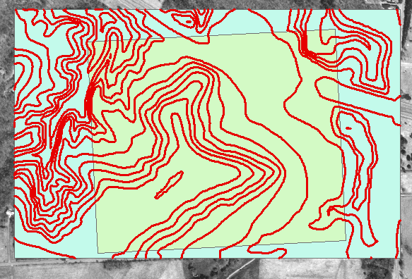
   The next step was to overlay the ArcMap data shown thus far with shapefiles that established boundaries for both navigation and that of the collection points. Both boundary shapefiles (fig. 6) used the same projection and coordinate systems as those in the aerial and contour data mentioned above and shown in figures 4 and 5, respectively.
  
   Figure 6a shows how the shapefiles appeared when they were initially brought into ArcMap. In order to allow the B/W aerial images to be seen, the transparency of the navigation boundary (blue) was increased until some of the imagery showed through (fig. 6b). The reason for adjusting the transparency of the navigation boundary, as opposed to making it an outline with a hollow outline, was so that if pencils were needed to track bearings the markings would show up. Similarly, it is for this reason also that the color of the navigation boundary was changed to yucca yellow (fig. 6b).

    Also, the opaque point collection boundary (green) in figure 6a was made hollow and the weight of its outline increased from a value of 1 to 2 (fig. 6b). The point-collection and navigation were important to incorporate into the navigation map because they could allow one to recognize when they have overstepped the bounds of the AOI in the field.

Figure 6


a
b

Figures 6a and b show the navigation-(blue) and point-boundary (green) shapefiles that were added to ArcMap. Notice that the layers in 6a are opaque, thus blocking the B/W aerial images behind. To correct this the transparency for the navigation-boundary was increased to 50%; the color of the navigation-boundary was changed as well so that the map could be marked and so that those markings be easily read in the field if necessary. Similarly shown in 6b, the point-boundary shapefile was made hollow and the outline increased in weight from a value of 1 to 2.


    The next step in making the maps was to overlay them with a grid system. Two grid systems (GSs) would be used two overlay each map, and would thus be the distinguishing feature between the two final maps. For example, the first map will be created with a meter based GS while the second will use decimal degree based GS. The different grid systems will allow for distance to be accurately gauged in the field by using measuring methods such as a pace-count, which was determined in class for each individual student. Following is a step by step guide to create the required grids:

 Changing the orientation and size of the ArcMap layout

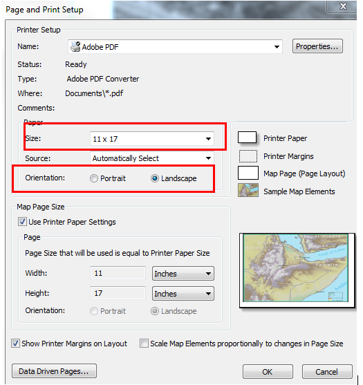
  1. Access the ArcMap Page and Print Setup interface (fig. 7).
  2. Change the following parameter inside the interface as follows: Size to 11 x 7 and orientation form portrait to landscape (fig. 7; red rectangles).

Figure 7

Figure 7 shows the page and print setup interface where the size and orientation parameters (rectangles) will need to changed 11 x 7 and from portrait to landscape.

   Creating the Grid (meters)
  1. With the AOI displayed in ArcMap's layout view as desired, right-click on the data frame until a drop box opens. Navigate to properties and click on it to open the data frame properties interface.
  2. Inside the data frame properties interface, navigate to the grids tab. Next click on the new grid button; this will open the grids and graticules wizard interface. 
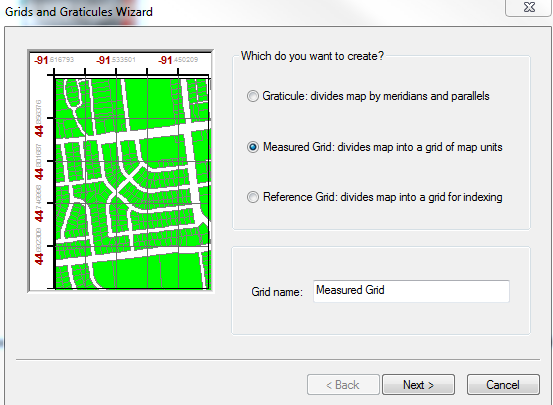
  3. In the grids and graticules wizard interface click on measured grid; the interface should appear as shown in figure 8a.
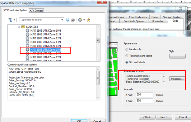
  4. Click next and click on the properties button next to box that displays the coordinate system. Ensure that the projected coordinate system shown in the resulting spatial reference properties interface is NAD_1983_UTM_Zone_15N, as shown in figure 8b.
  5. Once back in the grids and graticules wizard interface, before clicking next, change the default x- and y-axis intervals from 500 and 300 meters to 50 meters each. Doing so should ensure a GS that is not cluttered, but also precise enough to ensure land navigation.
  6. The next steps will be to click next in the grids and graticules wizard interface, making desired changes to font and the number of decimal points to create an aesthetically pleasing map. When the desired changes are made finalize the GS by clicking finish.
Figure 8
a
b

Figure 8a shows how the grids and graticules interface should appear once measured grid is selected. Figure 8b shows the spatial references interface which should be used to ensure that the grid will be projected as a UTM Zone 15N in the NAD 1983 coordinate system, as to be consistent with the projections of the shapefiles and images used to create the land navigation maps.

Creating the Grid (angular)
 Steps 1 through 2 as outlined in the previous section for creating the grid in meters should be followed for the creation of an angular grid.
  1.   Same as in creation of a meter grid.
  2. Same as in creation of a meter grid.
  3. Once the grids and graticules wizard interface is open, use the default setting of graticules, which will create a longitudinal-latitudinal grid system; click next.
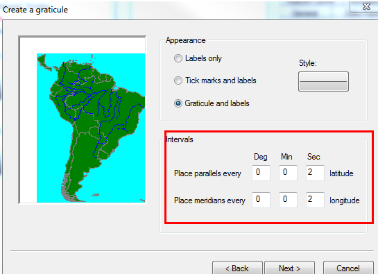
  4. In the intervals section, change the default SEC setting to 2 for both latitude and longitude (fig. 9a, rectangle). Then click next.
  5. Continue to click next, changing the font along the way as desired. Also, ensure that the grid will display decimal degrees which will be easier to utilize with a compass in the field. Click finish to finalize the grid.
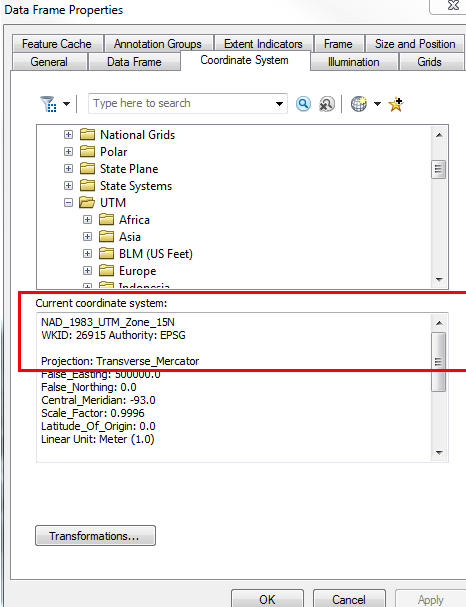
Using the graticule button in the grids and graticules wizard interface, does not allow one to check/change the coordinate system as when the measured grid button was used was done when creating the meter-based grid. However, the data frame coordinate system/projection can be checked for the angular grid by ensuring that NAD_1983_UTM_Zone_15N is the projected coordinate system in the coordinate systems tab of the data frame properties interface (fig. 9b).

Figure 9

 a b
Figure 9a shows the interval parameters adjusted to 2 Sec of latitude and longitude in the graticules wizard interface (rectangle). Figure 8b shows how the data frame's coordinate can be verified in the data frame properties interface, since it cannot be done in the graticules wizard interface as was done when creating a meter-based grid system earlier in this lab.


 Final Maps

   The finishing touches to the maps were done in ArcMap's layout view. This ensured that the maps display all the required information, such as a north arrow, scale (bar and repetitive-fraction), source data, water mark, and grid labels can be displayed in a functional manner. Functional means that the maps need to not only display the required  the information as listed above, but also ensure that the largest, most detailed scale could be used to convey the AOI. In the case of this assignment the largest scale possible and allowed the full extent of the point-boundary to be displayed was 1:3000.

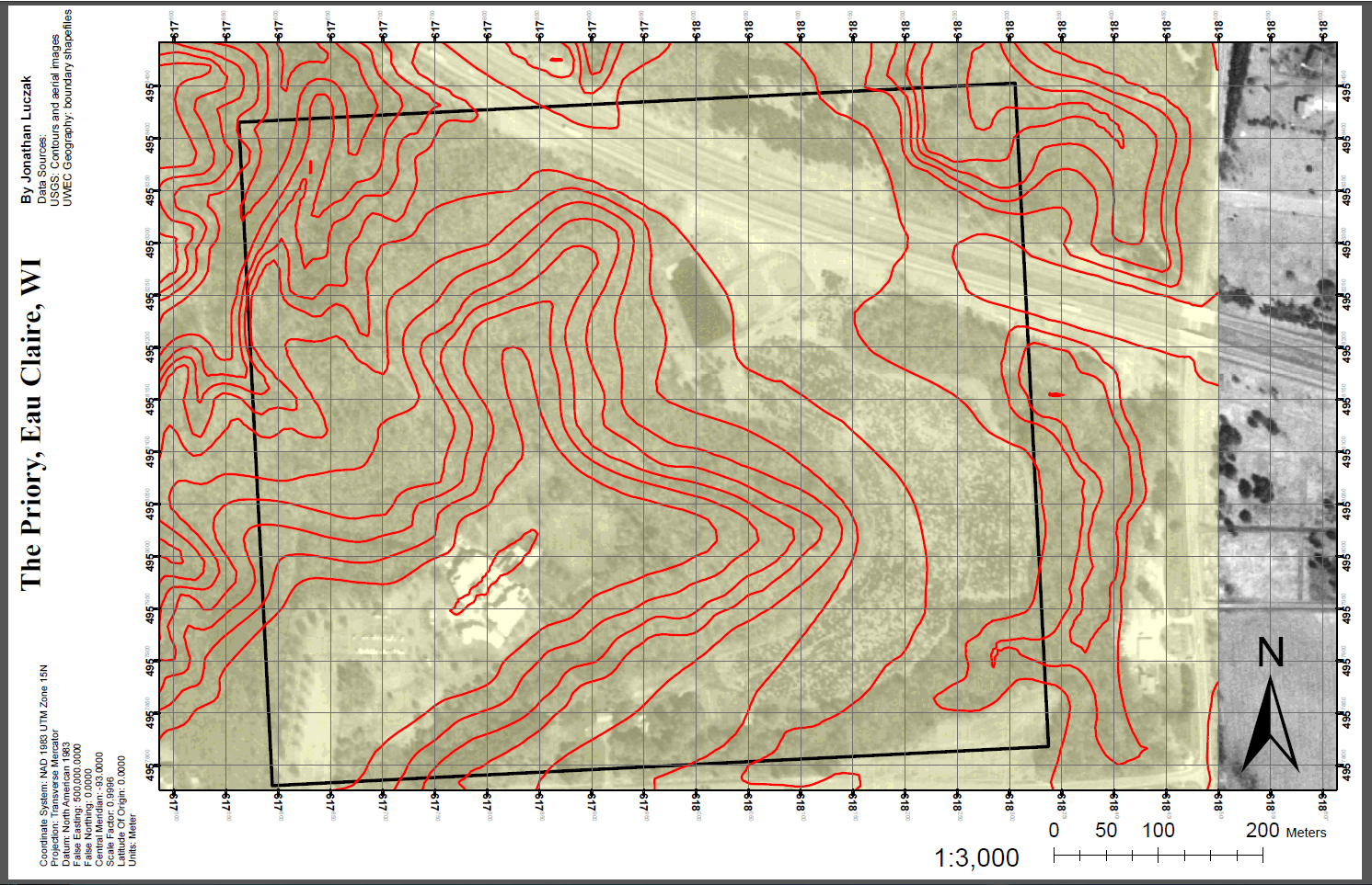
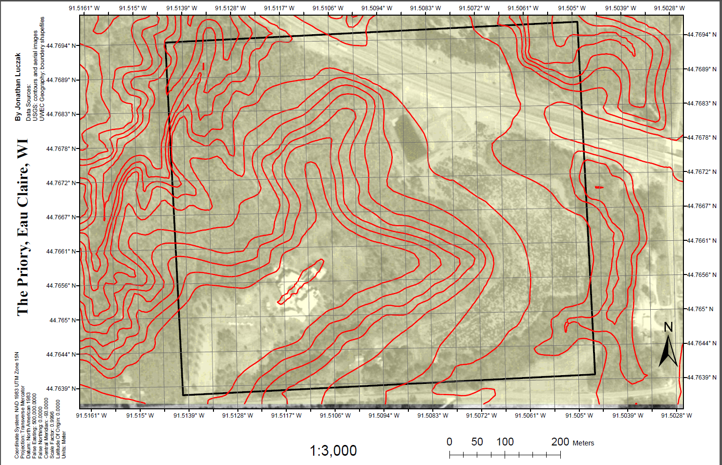
The final maps are nearly identical to one another in terms of layout, coordinate systems/projections, and color scheme. The only major difference between the maps are the navigation grids that overlay them; with figure 10 showing the meter GS and figure 11 showing the map overlaid with the angular grid network.

Figure10
Figure 10 shows the map of the Priory that was created using a meter-based GS, which overlays the map both vertically and horizontally at 50 meter intervals.

Figure 11


Figure 11 shows the second map of the Priory that was created in this lab. This map differs from the one found in figure 10 in that the overlying GS is angular as opposed to being meter-based. 2 second intervals for both longitude and attitude were chosen for this particular map.

Compass Navigation

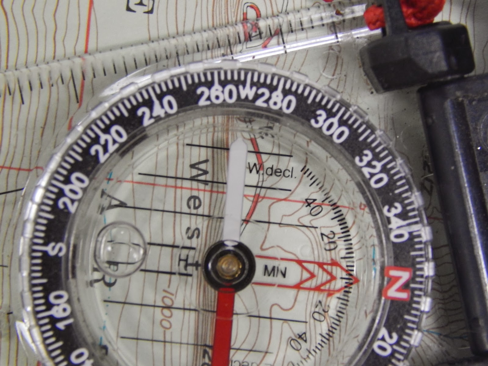
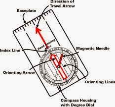
  At least one, if not both, of the final maps created above will be used to navigate the priory with a compass. In order to do this one needs to be familiar with a compass. Figure 12 shows a typical compass that is used for navigation purposes. The magnetic needle will always indicates magnetic north with its re end. Since declination in Eau Claire, Wisconsin is negligible, i.e. just over a degree or so, it will not be discussed. Also, the baseplate of the compass is usually clear to ensure that features on the map can be seen through it , specifically so that grid lines can be oriented with the orienting lines on the compass. Following are some general guidelines to land navigation:

Map Bearing


  1. Ensure that the direction of travel arrow (DTA) is oriented on the map so that it coincides with the direction of travel on the ground. 
  2. Next, line one of the long edges of the compass so that it connects one's current position to that where one wishes to go; DTA facing the target. Also, connecting the two points on the map using a pencil and the compass as a straight-edge is useful.
  3. Rotate the compass bevel (compass housing dial in fig. 12) so that the fixed orienting arrow points at MAP north; make use of the grid lines created on the final map for this purpose. 


    4. Remove the compass from the map and hold it steadily in front of one's self. Rotate until the red
        end of the magnetic arrow fits into the hollow orienting arrow. Keep the "red in the shed" while           moving in the direction indicated by the DTA to the desired target.


The following website also contains some useful information from an excerpt  the principles of land navigation with a compass: https://www.princeton.edu/~oa/manual/mapcompass2.shtml.

Figure 12
 
Figure 12 shows a compass that is typically used for land navigation purposes and orienteering exercises, like those that will be conducted later in the semester. Note that the baseplate in a typical compass such as one illustrated above will be clear in order to take a map bearing (https://www.princeton.edu/~oa/manual/mapcompass2.shtml).


Discussion

   The final two maps that will be used for land navigation at the priory were created as described in the methods section above. The two maps are identical to one another in terms of color scheme, layout, map projection/coordinate system (UTM Z15N and NAD 1983, respectively), and scale. However, the maps differ in the way the grids were laid out on top of them. For instance, figure 10 shows the map overlaid with a meter-based GS, while figure 11 show the map overlaid with the angular GS.

  While it was not readily apparent why the two maps with different GSs were created, when looking at the geospatial blogs from 2013, it seems that different methods of navigating the Priory might be employed. For instance, one method of navigation involved compass navigation to determine the location of data points, while another outing at the Priory utilized GPS technology to find and map the points.

The fact that both maps used the aerial imagery should help with navigation in the field. One thing regarding aerial imagery, however, is that it is difficult to read pencil markings on maps that use them. The use of a transparent, light-colored navigation boundary should aid to alleviate this problem.

In order to maximize the extent of the map, ancillary map features such as a legend were not used for this project. This was to ensure that the maps could be displayed with the maximum scale possible, which is hoped to increase the accuracy with which the data points are collected in the field.

However, if any problems do arise with the layout of the maps they can be easily remedied as they are saved in the UWEC servers. The only real problem that was encountered during this lab was the creation of a watermark. As such, neither one of the final maps in figures 10 and 11 have one, though they were both created by the author of this report alone.

  Conclusions

Both maps that were created for this lab were done so to ensure the easiest navigation possible. For instance both maps were checked to ensure that they were in fact using NAD 1983 coordinate system and that the projections for both maps were done so using UTM Zone 15N; as this seemed to be an issue for some of last years students. Also, the color schemes of the maps were chosen in order to allow

While it seems that proper measures were taken to ensure that the maps that were created for land navigation at the Priory, only actually doing so will actually prove whether or not this is true. Proper and thoughtful planning can help to snuff out problems before they arise, but it is usually the unforeseen ones which stifle even the best plans; it will be interesting to see how the maps perform in the field.

Works Cited


Bristol, H., 2013: http://hbristolfields.blogspot.com/2013/03/field-navigation-maps.html (accessed February 2014).

USGS, 2001: http://pubs.usgs.gov/fs/2001/0077/report.pdf (accessed February 2014).


Sunday, February 23, 2014

Lab 4: Conducting a Distance Azimuth Survey

                            Group 6: with Carolyn McLeish and Emily Merkel


Introduction

 While today's GPS technology can be used to accurately determine the location of points on a map for a geographical survey, it is important to also become familiar with less advanced survey methods as well. These more basic survey methods include the distance azimuth survey, which is the method that will be examined in this report. By measuring both the horizontal/vertical distance (meters) and azimuth (degrees) of an object, e.g. a tree or bike-rack, from a stationary location with known coordinates, one can determine where to plot that specific point on a map.

The reason for using more traditional survey methods and tools is that complex electronic devices such as GPS are prone to malfunction for a variety of reasons. Furthermore, if one were surveying an extremely remote location, it might be best practice to use both a GPS method and a distance azimuth survey to ensure  all the necessary data were collected accurately and to negate the possibility of an expensive resurveying of the area due to inaccurate data points.

Some of the more basic tools used to conduct a distance-azimuth survey are as follows: a compass and distance finder/tape-measure, or laser a device that can measure both an object's horizontal distance and azimuth, such as the TruPulse laser device (fig. 1). While the TruPulse laser device was convenient for this survey, it too is electronic which means that it could malfunction in the field like a GPS unit. For this reason, our class received additional instruction on how to properly use both a Suunto compass and a sonic distance finder to take the azimuth and x-y distance, respectively. While the compass and distance finder require more work and are more prone to human error than using the all-in-one measurement capabilities of the TruPulse, it is still important to learn how to use them should the need to do so arise.

Once the distance-azimuth survey was completed, the data were entered into Microsoft Excel, and from there converted using the "bearing distance to line" tool in ArcGIS into feature-class points. Finally, these points were superimposed over a Bing imagery map to asses the accuracy of the survey.

Figure 1


Figure 1 shows the TruPulse laser device (yellow) that was used to measure both an object's slope distance and azimuth. For this lab, the laser device was mounted to a tripod to ensure that it would remain in the same location. Using the  single point of origin at the tripod ensured that only one decimal degree location would need to be found. From this decimal degree origin, all other data points measured by the TruPulse throughout the survey could be calculated later on with computer programs when they were entered into ArcGIS.

Methods

Area of Interest


 Given the criteria listed above, the origin of this distance-azimuth survey was located next to the Nursing Education building on the UW-Eau Claire (UWEC) campus. Figure 2 shows aerial image of the AOI; U.S. highway 12/Clairemont Ave. runs along the lower portion the smaller image, while the red X in the larger image approximates the location in which the TruPulse laser device was set up on a tripod (fig. 3). It was approximated from the Bing aerial imagery that the origin was located at 44.797244o N and 91.502394o W.

The size of the AOI was decided to be 1 hectare, which was based on the size parameters in the lab instructions. However, although group 6's AOI fit the 1 hectare maximum, no 100 m x 100 m square was actually measured out. Instead, it was decided to simply limit the range of the laser device to less than/equal to 100 meters in any direction. It is now apparent that this was a mistake and the range of the measuring device should have been limited to objects 50 meters in any direction from the point of origin to ensure a 1 hectare AOI. Doing this would have placed the origin in the center of the square. However, even though AOI did not turn out to be a perfect square, the area of the AOI should fall into the overall parameters set by the lab instructions as to the extent of the AOI. This is because the Nursing Education building was behind the origin thus preventing the creation of a 2 hectare AOI.

Figure 2

Figure 2 shows the origin point that was chosen for the distance-azimuth survey. Marked by the red x, the point of origin was approximated at: 44.797244o N and 91.502394o W. The locations of the points later surveyed in the AOI were calculated using these coordinates in an ArcMap program.

Data Collection


 It was important to select a point of origin for the survey that was both visible from aerial imagery and one that was relatively permanent. This is because decimal-degree coordinates from Bing Map (in ArcGIS) were needed for the point of origin, which was the location where the tripod was set up with the laser device for the survey. Also, if any of the points needed to be resurveyed for any reason, the permanence of the origin point is essential. For example, if five points needed to be recollected, then the survey tool should be set up in the same location during the resurvey as it was in the initial survey; a failure to do this would mean that the points in the resurvey would be substantially different than those in the initial one.

It was decided that the TruPulse laser device would be used to collect data points for the survey because this tool allowed for both the slope distance and azimuth of an object to be collected with just a push of a button to switch back and forth between the two. The general procedure for collecting the distance/azimuth data is as follows:

  •  The laser device was pointed at whatever object was to be measured. In the case of this lab, any stationary object was chosen, such as a lamp post, fire-hydrant, tree, bench, garbage can, etc. because the main purpose of this lab was to be introduced to the methods and tools associated with a distance-azimuth survey.
  • Once the desired object was in the cross-hairs of the laser device's viewfinder, the operator pressed the fire button located on the top of the TruPulse (fig. 3). The laser device would then display in the upper portion of the viewfinder either the azimuth (degrees) or the slope distance (meters) for that object; the operator would toggle between these two parameters, depending on whether the distance or azimuth was desired (fig. 3).
  • Once either the distance or the azimuth was measured, the person operating the laser device would announce the resulting measurements to another team member who was recording the information. In addition to the azimuth and slope distance, the name of the object being measured was recorded as well.

As mentioned in the AOI method section above, the point of origin for the survey was determined to be at the northeast corner of the Nursing Education building on the UWEC campus. A tripod was used to ensure that the TruPulse laser device (fig. 1) remained in the same location throughout the survey. The use of a tripod was also useful because it enabled each member of group 6 to collect the distance and azimuth data throughout the survey without disturbing the point of origin.

Figure 3


Figure 3 shows the controls on the TruPulse laser device such as the fire button (under Emily's index finger) used to shoot the laser at an object to measure its distance/azimuth. Also, the toggle switches are use to switch back and forth between the distance and azimuth in order to obtain measurements for each via the same device. The thick yellow arrow shows the direction that the laser path takes to the whatever object is in the TruPulse's viewfinder.


Magnetic Declination


Figure 4 shows a general magnetic declination (MD) map of the world, from NOAA. MD is a necessary correction in some regions of the world as the as magnetic north, as measured by a compass, can vary substantially from the geographically determined true north. While the declination map in figure 4 provides a good visual for understanding the concept of MD, it should not be used to determine MD. This is because, in addition to regional variance, MD will change temporally as well; for example, NOAA estimates that the MD for Eau Claire, specifically our point of origin, will change by a rate of 0.1 W per year.

From the national oceanic and atmospheric agency (NOAA: http://www.ngdc.noaa.gov/geomag-web/#declination), MD for this survey's point of origin in Eau Claire, WI was estimated at  1.07 W and is changing at a rate of 0.1  W per year. The MD for the specific origin point for our survey was done by entering the latitudinal and longitudinal decimal degrees for the point of origin as determined using Bing Map imagery. As mentioned in the AOI section of this lab, the latitude and longitude for the point of origin were 44.797244o N and 91.502394o W, respectively. The latitude and longitude were correlated to the point of origin for this survey because it was discovered that the  general MD for Eau Claire, based off the zip code 54701, were different than those at the origin point. For example, at post office the MD was 1.08o W and while still changing at a rate of approximately 0.1 W per year.

While MD for the AOI was low enough to negate its importance in terms of modifying azimuth measurements, this paper will compare map layers generated with the raw azimuth data from the laser device to those created with azimuth data corrected to the MD determined for the region. In order to do this, the 1.07 W was added to each raw azimuth value using an excel formula.

Figure 4

Figure 4 shows a modified map that illustrates magnetic declination (MD) from 2010. MD is a phenomenon which occurs because magnetic north, as measured by a compass, is often different than the geographically determined true north. The thick black contour line that bisects the U.S. in this picture represents no variance between magnetic and true north. Also, red and blue contour lines represent areas where magnetic declination is west (negative) or blue (positive). In addition to being a regional phenomenon, MD also varies temporally as well; thus, this 2010 MD map is of little value today in 2014, other than for instructive purposes, as the MD has surely changed since then.

Excel Spreadsheet


Data from the distance-azimuth survey were recorded into Microsoft excel. Information that was included in this spreadsheet is as follows: point number, distance, azimuth, and point data; point data just the name of the point measured. Also, as illustrated in figure 5a and b, both an x and y field were created in the excel spreadsheets as well. These x (-91.502394 ) and y (44.797244) fields respectively correspond to the longitude and latitude values determined for the point of origin from Bing maps, as discussed in detail in the AOI method section.

For the purposes of this lab, two excel spreadsheets were created, as shown in figures 5a and b. In one excel spreadsheet, the raw azimuth data were entered, i.e. the azimuth measurements as they were displayed in the TruPulse ( fig. 5a). A second excel spreadsheet was produced that corrected the azimuth measurements as they were reported by the laser device to better reflect the magnetic declination of the region (fig. 5b), as mentioned in the previous methods section that discussed magnetic declination in greater detail.

Figure 5
a
 b
Figure 5a shows the excel spreadsheet that was created using raw azimuth data from the TruPulse laser survey device. Figure 5b shows the excel spreadsheet that was created to adjust for MD. Note, besides "azimuth," all other fields are identical from the spreadsheet represented by 5a to the spreadsheet represented by 5b.


Map Creation

Two functions needed to be performed on the tables created from the spreadsheets above.First, the Bearing Distance to Line (BDL) tool was used to convert the data in the tables into a feature class of vertices. Next, a second ArcTool, Feature vertices to points (FVP) was used to create points from the vertices. Following are the steps that need to be followed to create each feature class. The specific tools themselves  can be found by using the "search"  interface in ArcMap, or by navigating through the ArcMap toolbox, to data management, to features, and finally to either to the BDL tool or the  FVP tool.

In order to create a map of the data points collected in the survey, it was first necessary to orient them on an x-y axis. To complete this transformation, the BDL tool in ArcMap was used to convert the field data collected during the distance-azimuth survey into a feature class that can be mapped using ArcGIS. Figure 6a give a general idea of how the parameters should appear. For instance, once inside the ArcMap program, the fields in the BLD interface should contain the following information:
  •  Input table should have contain the table generated from the excel spreadsheet.
  •  Output feature class  should contain the name of the destination file for the resulting feature class.
  • X field should contain the corresponding x-field from the table.
  • Y field should contain the corresponding y-field from the table.
  • Distance field should contain the corresponding distance-field from the table, in this case in meters.
  • Bearing field should contain the corresponding azimuth-field from the table, in degrees.
  • Click okay to generate the vertices feature class, which should appear like the image in figure 6b.

Figure 6

a 
b
 Figure 6a shows the parameters used by the BLD tool used to generate the feature class below it in 6b.

Once the vertices feature class is created (fig. 6b), it should be converted to a point feature class. To do this, the FVP tool in ArcMap should be utilized. Following is an example of the FVP interface (fig. 7a), as well as the parameters that should be used to create a point feature class in ArcMap:
  • Input features should contain the input feature class.
  • Output feature class should contain the geodatbase where the output feature class will be located once it is created.
  • Click okay on the FVP interface to generate the new point feature class (fig. 7b). 
Figure 7
a
b
Figure 7a shows the input parameters that could be used in the FVP interface to generate a point feature class like the one shown in 7b. Note that the green diamonds are the points associated with the point-feature class and the beige lines are associated with the vertices feature class. The vertices-feature class was left up in ArcMap when the screenshot in 7b was generated to show the relationship between the vertices-feature class and the newly generated point-feature class.

Once the vertices were converted to points using the FVP tool in Arc toolbox, the resulting point-feature class can be superimposed over the Bing imagery base map in ArcMap. Figure 8 shows a map that was created using the point-feature class generated above. The resulting feature class, which represents raw data that were collected from the field during the distance-azimuth survey, that is data that were not corrected for magnetic declination, was then superimposed over Bing Map imagery of the UWEC campus. Similarly, figure 9 shows the map that was generated by superimposing both the raw azimuth point-feature class data (red) and the point-feature class that was generated using azimuths adjusted to the MD of the point of origin; the yellow dot in both figures 8 and 9. Also, the same sized dots were used for both raw azimuth data points (red) and those adjusted to the MD associated with the point of origin (green) for the survey (fig. 9); this was done to ensure that a larger dot representative of a particular feature class would not simply appear to be offset by a smaller one, or vise-versa.

Figure 8

Figure 8 shows point-feature class (red dots) displaying raw azimuth data superimposed over a Bing Map base map in ArcMap. This was done in order to better asses the completed the accuracy of the survey. The point of origin for the distance-azimuth survey is represented by the yellow dot.

Figure 9

Figure 9 shows point-feature classes generated by using both raw azimuth data (red dots) and azimuth data that were adjusted to better reflect the MD at the point of origin (green dots) for the distance-azimuth survey (yellow dot).

Discussion

As expected, the 1.07 W MD associated with the MD in the AOI had no profound effect on the PFCs data in terms of their positions relative to one another. This fact supported in figure 9 where both the PFC for the raw azimuth data (red) is displayed in conjunction with the PFC associated with azimuth data adjusted to reflect MD (green dots).

When the point-feature classes generated in ArcMap were superimposed over a Bing imagery base-map it was apparent that some errors were present in some locations. For instance, the red square in figure 10, which displays on raw azimuth data, shows a data point that appears to be inside the nursing education building. According to the attribute table this point represents a tree and is obviously an inaccurate data point.

The next source of error is shown again in figure 10, but this time it is represented by the yellow circle in the parking lot. While a few data points were taken in the parking lot, none of them extended out as far as what is shown in the yellow circle in figure 10. While one could argue that the parking lot was altered during the construction of the new Davies center in 2012 and that this construction was the result of the cluster of points shown in figure 10, it is highly unlikely due to the fact that most of the points were trees.

Some of the data that were generated in the PFC appeared to be correct. This data includes the bike-racks outside directly in front of the Nursing Education building and are highlighted with the green rectangle in figure 10, just northwest of the point of origin.

As far as the accuracy of the remaining data points in figure 10, and in figure 8 and 9 for that matter, it would be interesting to see them superimposed upon imagery that included the newly constructed Davies center. Furthermore, some of the inaccuracies of the data points may be accounted for due to the fact that a major snow-/sleet-storm on had begun Thursday, February 20th when the survey was conducted.

The storm started about mid-way through the survey and it was at times difficult to obtain accurate readings with one shot of the TruPulse laser device. For instance, objects were measured at 5 meters away although they were clearly more than that. In cases like this, the obviously erroneous measurement was not recorded, and instead the laser was shot until a more believable measurement was displayed. Due to the way the TruPulse was behaving during the storm, this would have been a prime time to employ the use of the compass to obtain, or at least check, the accuracy of the azimuth as measured by the laser device; however, our group did not think to do this at the time.

There were other issues with the survey as well, all attributable to human error and a lack of proper planning. This included the determination of the AOI, s discussed in the methods section of this report. While a polygon measurement using tools in ArcMap revealed the total measured area of the AOI to be about 1.1029 hectares, more thoughtful planning could have been done to ensure that the 1 hectare maximum was not exceeded and that the AOI was represented by a perfect square, or more nearly so than in this particular instance.

Figure 10

Figure 10 shows some sources of error associated with the AOI in the distance-azimuth survey. For instance, the red square on the northwest corner of the nursing education building represents a data point the ArcMap attribute table associates with a tree. Also, the data points highlighted by the yellow circle should not be in scattered throughout the parking lot as shown here. In contrast, the bike-racks highlighted by the green rectangle just north and west the point of origin appear to be fairly accurate.

Conclusions

The distance-azimuth survey lab was interesting because it allowed one to gain a better grasp of the basic "map and compass" survey methods. These basic survey methods are important to know, as electronic technology can fail at any time. Our group experienced this failure first-hand when it appeared that snow may have disturbed the TruPulse laser devices collection of distance, and likely the azimuth data.

Mapping the data that were collected during the survey was an important skill to learn as well because it allowed for a more thorough analysis of the data points in ArcMap. For instance, if one were not able to map the points they would not be able to see how much or even if their survey data were inaccurate.

If the lab were to be done over again, it may be a good idea to at least calibrate a few data points using the compass and tape-measure/distance finder to ensure that the laser device was functioning properly.

For future labs, it would also be nice to have more time to complete the survey and analyze those results in ArcMap. This extra time could then be used to resurvey the erroneous data points in AIO in an attempt to correct mistakes made in the first one, if any were present.